
Brand identity & design system
The right touch,documented.
01 — Foundation
Who tapt is.
Tapt is a creative studio based in Antalya, working globally. We craft visual identities, digital experiences and brand systems with clarity and precision. Everything we make should feel smart, simple, and just right — like the perfect tap.
Design with intention
In a world oversaturated with noise and visuals, we believe in the power of subtlety. Nothing decorative — every choice earns its place.
No fluff, no fuss
Clear ideas, sharp execution, and the right touch. Strategic creativity that communicates clearly, resonates emotionally, performs functionally.
The right touch, for the right idea.
Always set in sentence case. The closing period may be set in Steel — it is the brand's signature mark.
PersonalityFive traits that steer every decision
Precise
Measured, never fussy. Grids, hairlines, tabular numbers.
Quiet
Dark, calm surfaces. Restraint is the loudest thing we do.
Confident
Oversized type, one accent, no apologies.
Human
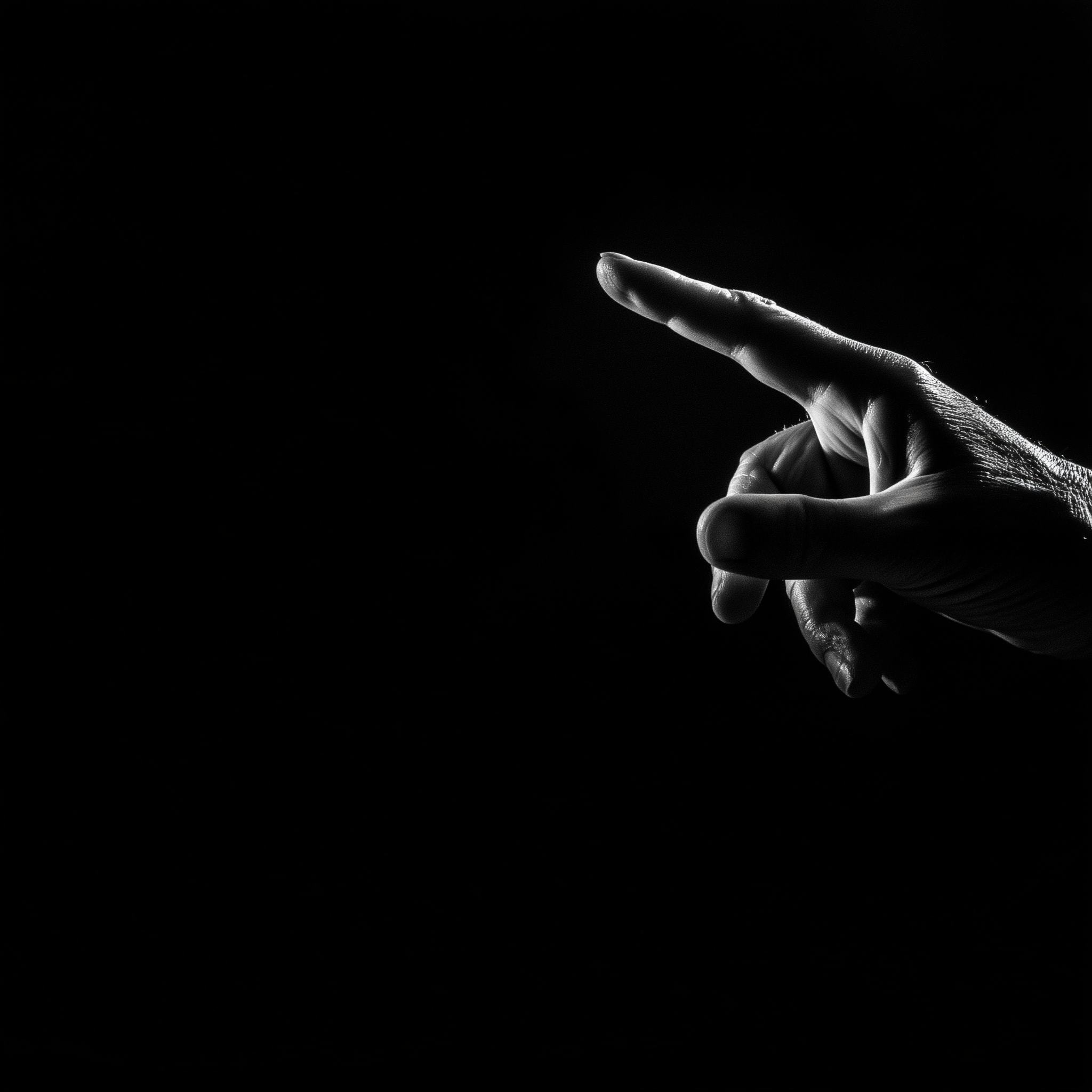
A fingertip, a tap, a spark of light — technology with touch.
Sharp
Clear ideas, executed without hesitation. Ship it, then stand behind it.
02 — Logo
The wordmark.
One logo, one lockup: the lowercase tapt.studio wordmark. The period is part of the mark — never remove it. No symbol, no monogram; the word is the brand.

ClearspaceGive the mark room to breathe
1× t-height
1× t-height
1× t-height
1× t-height
Minimum clearspace on all sides equals the height of the lowercase t in the wordmark. Nothing enters this zone — no text, no imagery edges, no UI.
Minimum sizeBelow this, legibility dies
Preferred — 200px+Comfort — 120pxMinimum — 80px screen / 22mm printMisuseNever do this
03 — Color
Dark silk + one spark of steel.
The palette is near-monochrome. Ink dominates, Paper relieves, and Steel appears only where something responds — interaction states, punctuation, live indicators. Steel is never decoration.
Click a swatch to copy its hex.
ProportionHow much of what
Steel is the last 2% — if a layout feels like it needs more blue, the layout is wrong, not the ratio.
AccessibilityVerified pairs (WCAG 2.1)
| Pair | Contrast | Use | Rating |
|---|---|---|---|
| AaWhite on Ink | 19.4 : 1 | Body & display text | AAA |
| AaInk on Paper | 17.8 : 1 | Body & display on light | AAA |
| AaGray on Ink | 6.4 : 1 | Secondary text on dark | AA |
| AaGray-Ink on Paper | 5.3 : 1 | Secondary text on light | AA |
| AaSteel on Ink | 5.6 : 1 | Accent text on dark | AA |
| AaSteel on Paper | 3.2 : 1 | Large text / icons only | AA-Large |
04 — Typography
One family, all the hierarchy.
Blauer Nue is the only typeface. Hierarchy comes from weight and scale — never from a second family. Fallback stack: 'Blauer Nue', 'Helvetica Neue', Helvetica, Arial, sans-serif.
ScaleType system (1rem = 10px)
| Mega display | WORK | 16–24rem · 600 · ls -0.05em · lh 0.8 |
| Hero / H1 | The right touch, | clamp(4.6–12.4rem) · 500 · ls -0.045em |
| H2 section | Four disciplines | clamp(3.4–9.6rem) · 500 · ls -0.03em |
| H3 / card | Vantas Kolektif | 2.2–3.4rem · 500 · ls -0.01em |
| Body | We craft visual identities, digital experiences and brand systems with clarity and precision. | 1.7–1.9rem · 300 · lh 1.6–1.65 |
| Eyebrow | Creative studio — Antalya | 1.3rem · 500 · ls +0.22em · caps |
| Meta / data | 2026 · 24+ · 20:52 | 1.2–1.5rem · 400 · tabular-nums |
Two laws: display type always tracks negative (-0.03 to -0.05em); small caps labels always track positive (+0.18 to +0.24em). Numbers in data contexts are always tabular-nums.
SpecimenCharacter set
AaBbCcDdEeFfGgHhIiJjKkLlMmNnOoPpQqRrSsTtUuVvWwXxYyZz 0123456789 ışğüçöİĞÜÇÖ (.,;:!?—·●→)
05 — Grid & Spacing
The invisible discipline.
Layouts sit on a 12-column grid with fluid gutters. Depth comes from hairlines and surface shifts — never from drop shadows on flat UI.
Section horizontal padding: 8rem → 5rem @1600 → 2.4rem @900. Grid gap: 4rem → 2.4rem.
Spacing scaleRhythm tokens
RadiusFour corners, one pill
06 — Motion
Everything answers the tap.
Motion expresses cause and effect — a response to the user, never decoration running on its own. One easing curve unifies the whole system.
| Signature ease | cubic-bezier(.22, 1, .36, 1) — fast out, soft landing (expo-out family) |
| Micro interactions | 150–400ms — hovers, presses, toggles |
| Reveals | 800–1100ms — word-masks, fades; stagger 60–80ms per word/item |
| Scrub effects | Bound to scroll, no duration — fill-reveals, display-type scale |
| Reduced motion | prefers-reduced-motion is law: all animation collapses to instant states |
Signature movesThe brand's motion vocabulary
Word-mask reveal
Headlines rise word-by-word from an overflow mask. +70ms stagger.
Scramble decode
Uppercase eyebrows decode from random characters over 900ms on entry.
Fill reveal
Display words start dim and fill with color as you scroll — gray → white / ink.
Tap ripple
Every click emits a steel ring from the pointer. The brand motif as feedback.
Magnetic pills
Buttons lean toward the cursor and release with an elastic snap.
Label slide-swap
Button labels slide up and are replaced by their twin on hover.
07 — Imagery
Dark silk, light signal.
Imagery is the brand's texture. Three families only — and everything is near-monochrome with a cool, steel-blue cast. If an image needs a caption to feel on-brand, it isn't.

Stock selection rulesWhat to pick, what to skip
Select
- Macro fabric, liquid or smoke on black — long-exposure light trails
- Monochrome hands: pointing, touching, holding light
- Cool tones only — desaturate, then let blue survive
- One clear subject, generous negative space (type must fit)
- Video: slow, loopable, abstract movement
Skip
- Bright lifestyle / office stock — smiling teams at whiteboards
- Warm or saturated palettes, sunsets, neon rainbows
- Literal metaphors: lightbulbs, rockets, puzzle pieces, handshakes
- Busy compositions with no room for the wordmark
- Anything that fights the Steel accent with its own accent
Treatment recipe for any stock frame: desaturate to ~15%, lift blacks to Ink #06080A, add a top-down rgba(6,8,10,.55→.9) scrim when type sits on it.
08 — The Dot
One period, everywhere.
The period in tapt.studio is the entire graphic system. It reappears as the Steel dot: sentence-closing accents, list bullets, live indicators, the cursor, the tap ripple. It is the only ornament the brand allows.
Rules: the dot is always Steel, always a perfect circle, never larger than 40% of the adjacent x-height, and never appears more than once per element.
09 — Applications
The system in the wild.
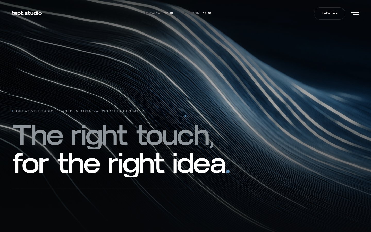
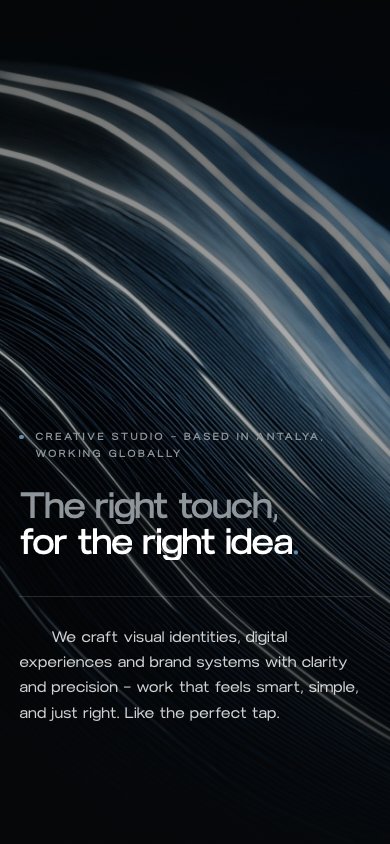
Reference implementations. Digital first: the website is the flagship application of this system.
Web — desktoptapt.studio homepage
Web — mobileResponsive
SocialAvatar & profile tiles
Avatar = lowercase t + Steel dot on Ink. Wordmark never goes in a square avatar.
EmailSignature block
Olcay Dikici
Founder & Creative Director
hello@tapt.studio · tapt.studio
Antalya — working globally
PrintBusiness cards
Print spec: 85×48mm, soft-touch matte laminate, Ink 5/0 + Steel spot (Pantone 5415 C approx). The Steel dot may be spot-UV.
10 — Voice & Tone
Say less, mean more.
The voice is the design: precise, quiet, confident. Short sentences. Concrete words. A full stop instead of an exclamation mark — always.
We sound like
- "No fluff, no fuss. Just clear ideas, sharp execution, and the right touch."
- "We design with intention."
- "Tell us what you're building."
- Sentence case everywhere — even headlines. Caps are reserved for eyebrows and data labels.
We never sound like
- "We're a passionate, award-winning, full-service 360° agency!!!"
- Buzzword salads: synergy, disruption, next-gen, cutting-edge
- Exclamation marks, emoji in brand copy, ALL-CAPS shouting
- Hedging: "we try to", "we hope", "maybe", "world-class-ish"
Checklist before anything ships: Is it true? Is it short? Would it survive being read aloud in a quiet room? If yes — ship it.