← All work · Case study — brand identity
Vantas Kolektif.
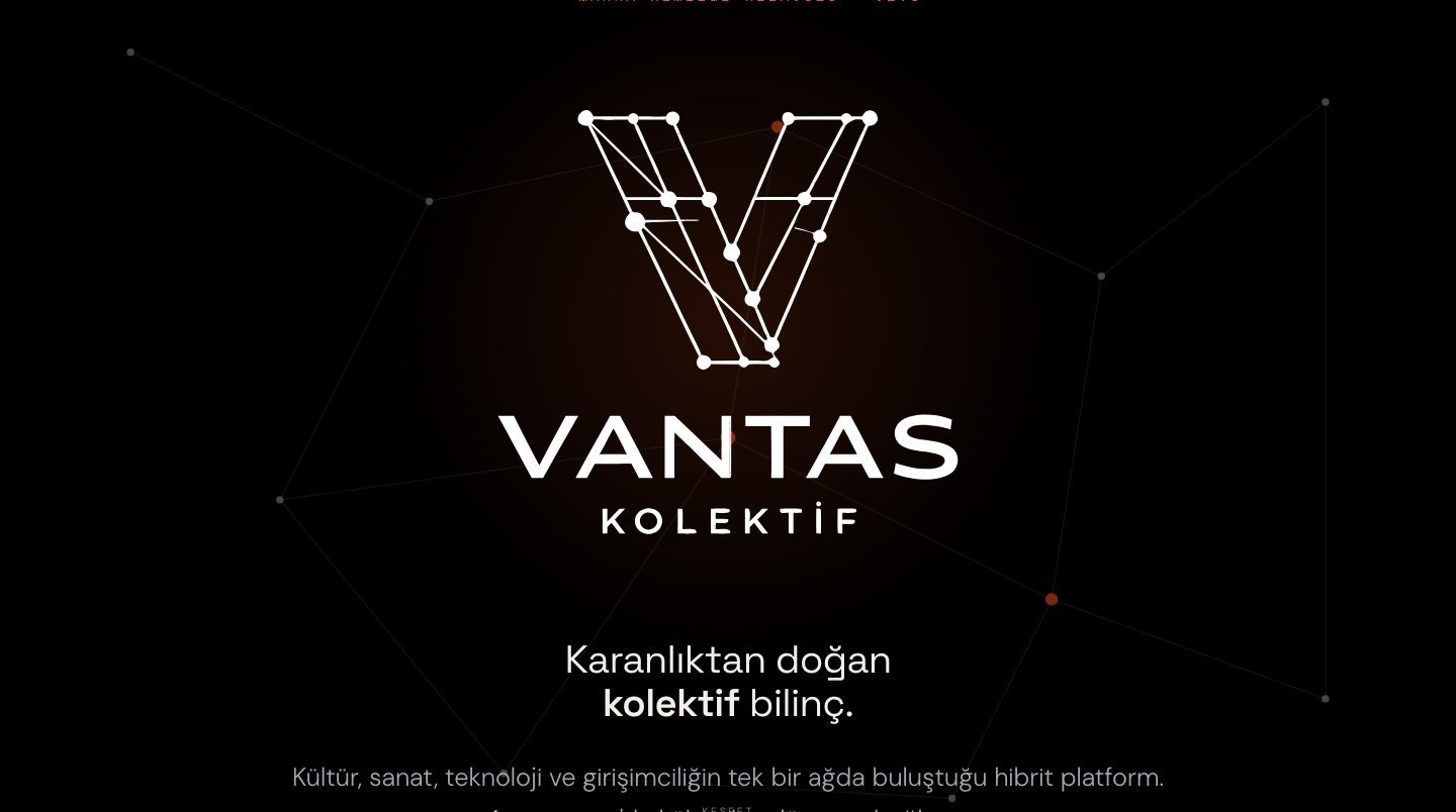
A collective consciousness born from darkness — brand identity for a hybrid platform where culture, art, technology and entrepreneurship meet on a single network.
The brief
Vantas needed an identity as uncompromising as its name. A collective that hosts artists, technologists and founders on one stage — local roots, global signal — without ever raising its voice.
The response
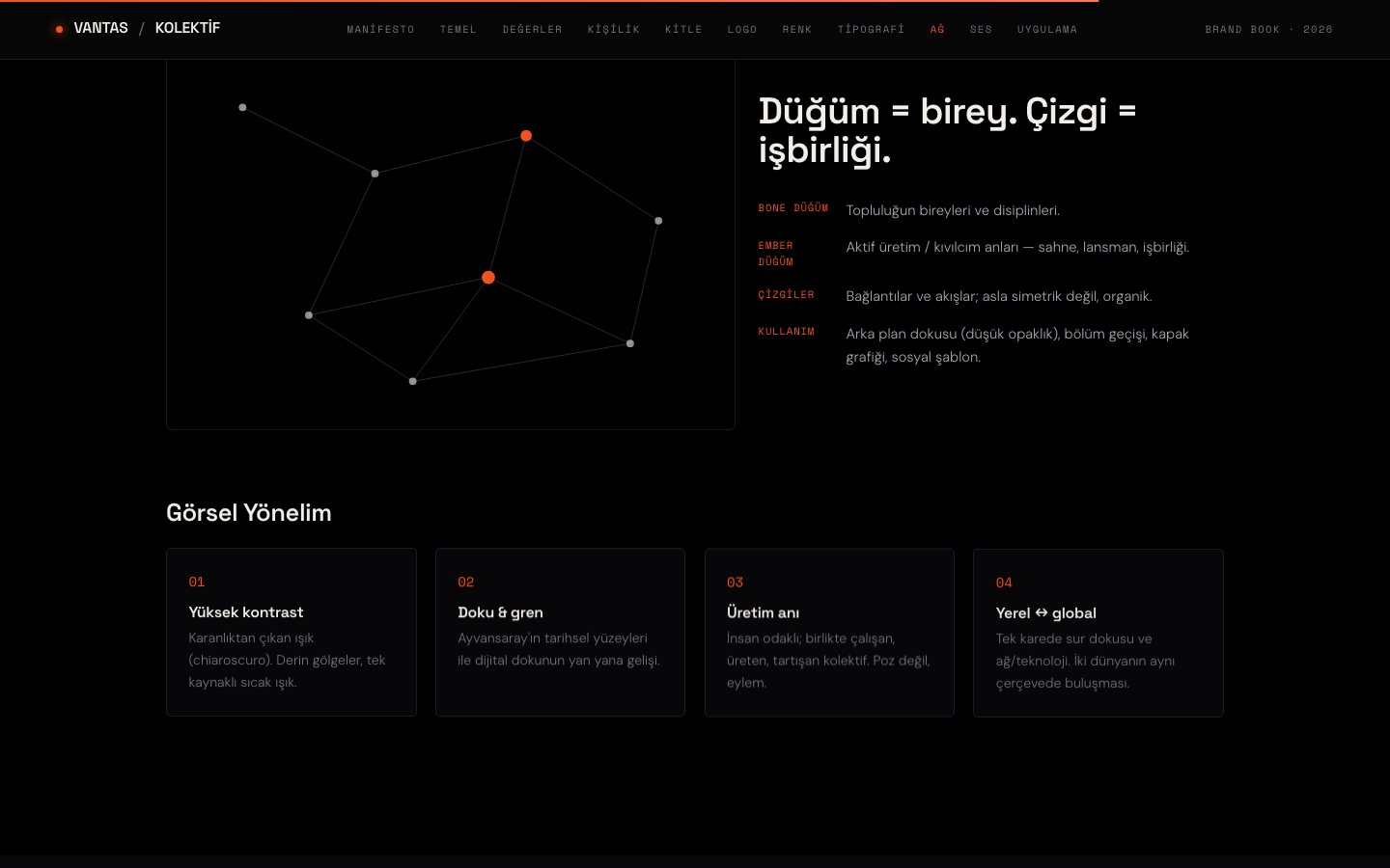
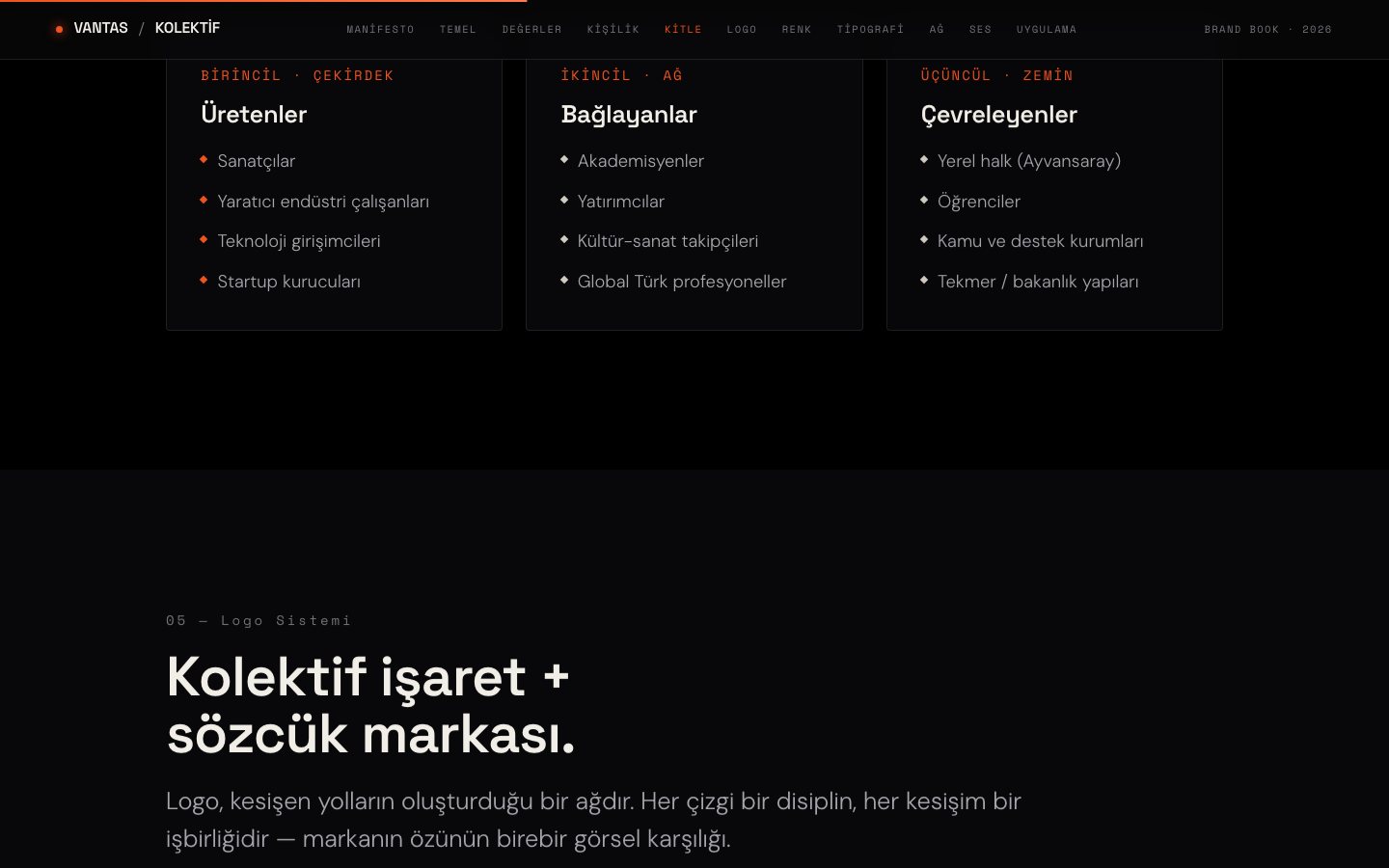
Absolute black, a single spark. We built the brand as a network: every node a discipline, every line a collaboration. The V mark is drawn from intersecting paths — the point where the collective connects.
Design system
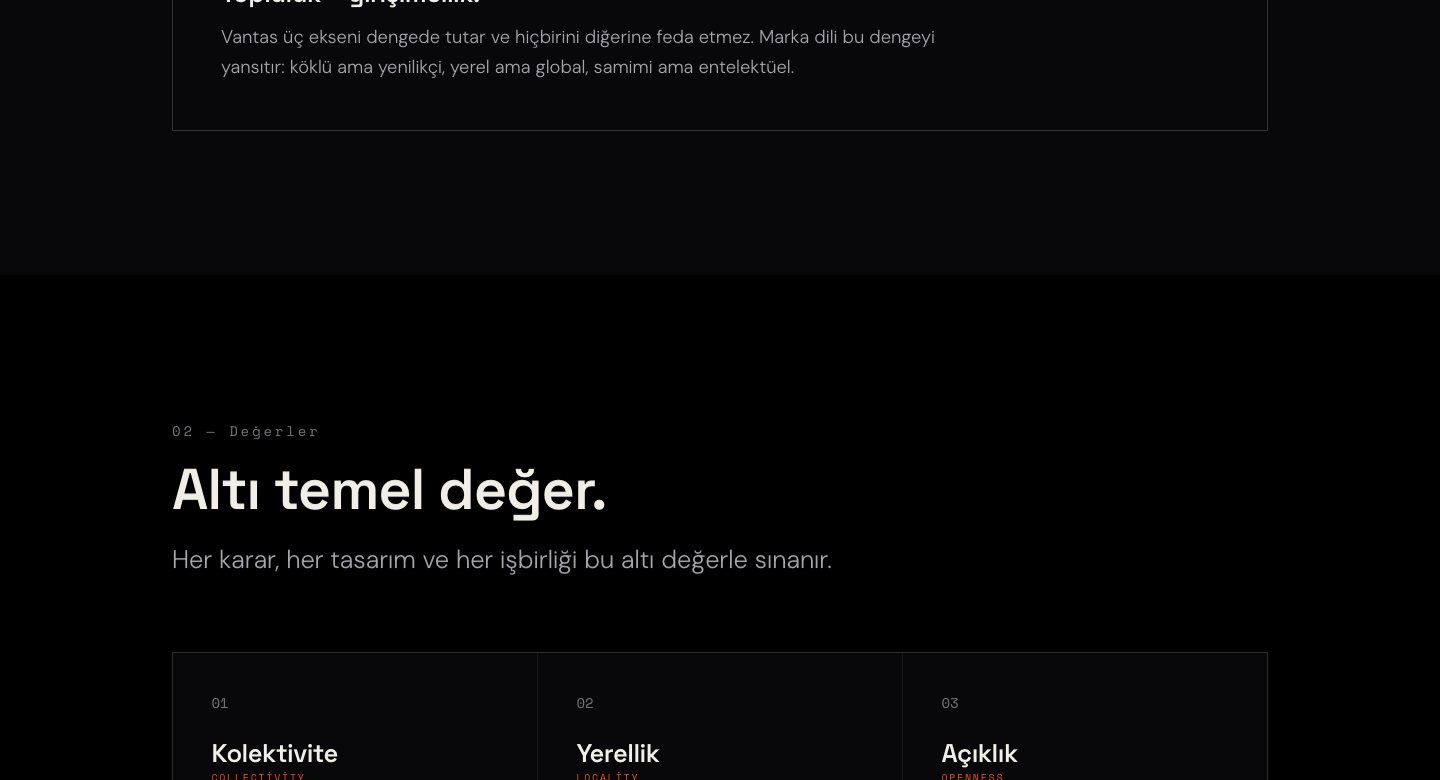
Absolute black
+ a single spark.
Vantablack#000000
Carbon#121216
Ash#74747C
Stone#CFCBC1
Bone#F2EFE8
Ember#F0531E
Space Grotesk
Display — headlines & wordmark
DM Sans
Body — reading text
Space Mono
Data — labels, indexes, meta
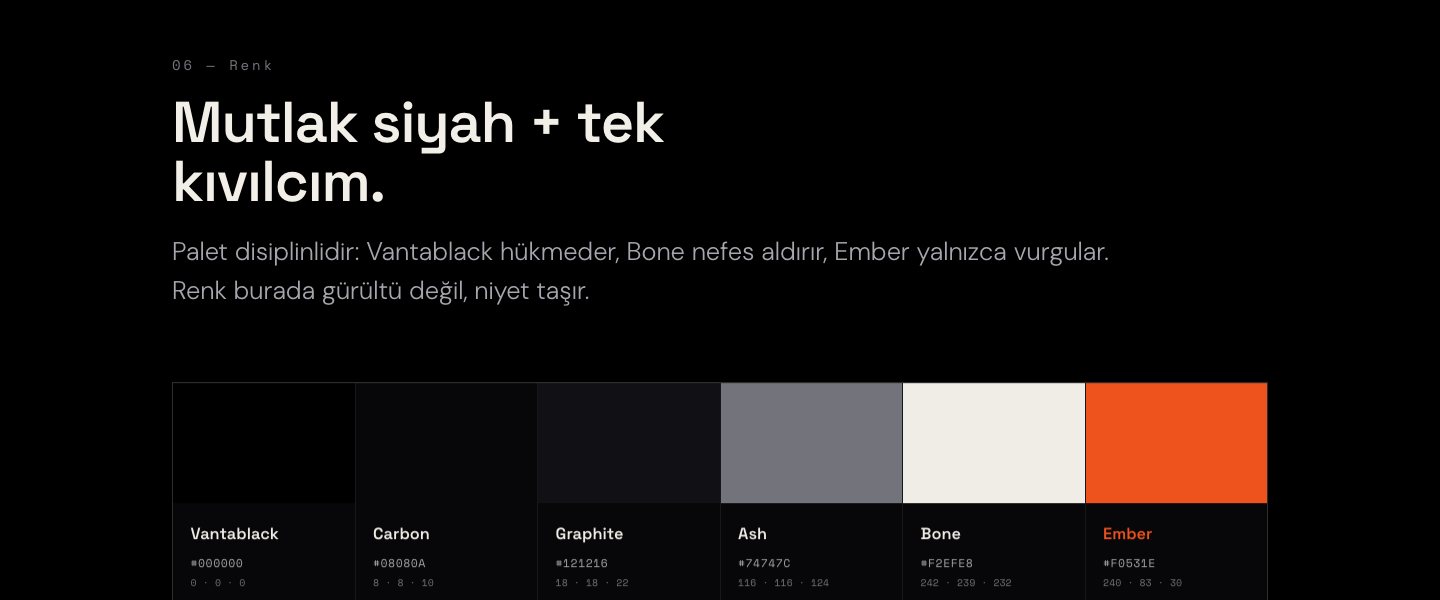
Color carries no noise here — it carries intent. Vantablack rules, Bone breathes, and Ember strikes only when there is something worth igniting.— Vantas Kolektif brand guidelines, v1.0